
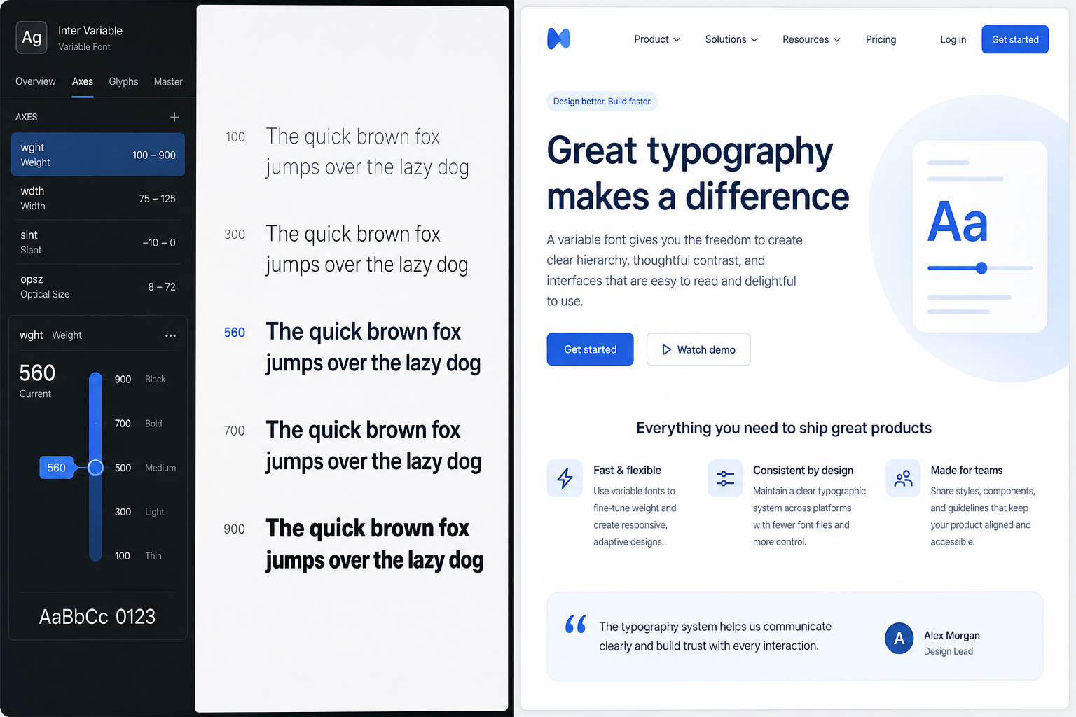
Digital design typography is no longer a finishing touch — it is a core engineering and UX decision. The typefaces you choose shape how quickly a page loads, how accessible your interface feels to every user, and how strongly your brand registers across dozens of screen sizes. In 2025, designers who treat type as purely aesthetic are leaving measurable performance and inclusivity gains on the table.
Why Typography in Design Is a UX Decision, Not Just an Aesthetic One
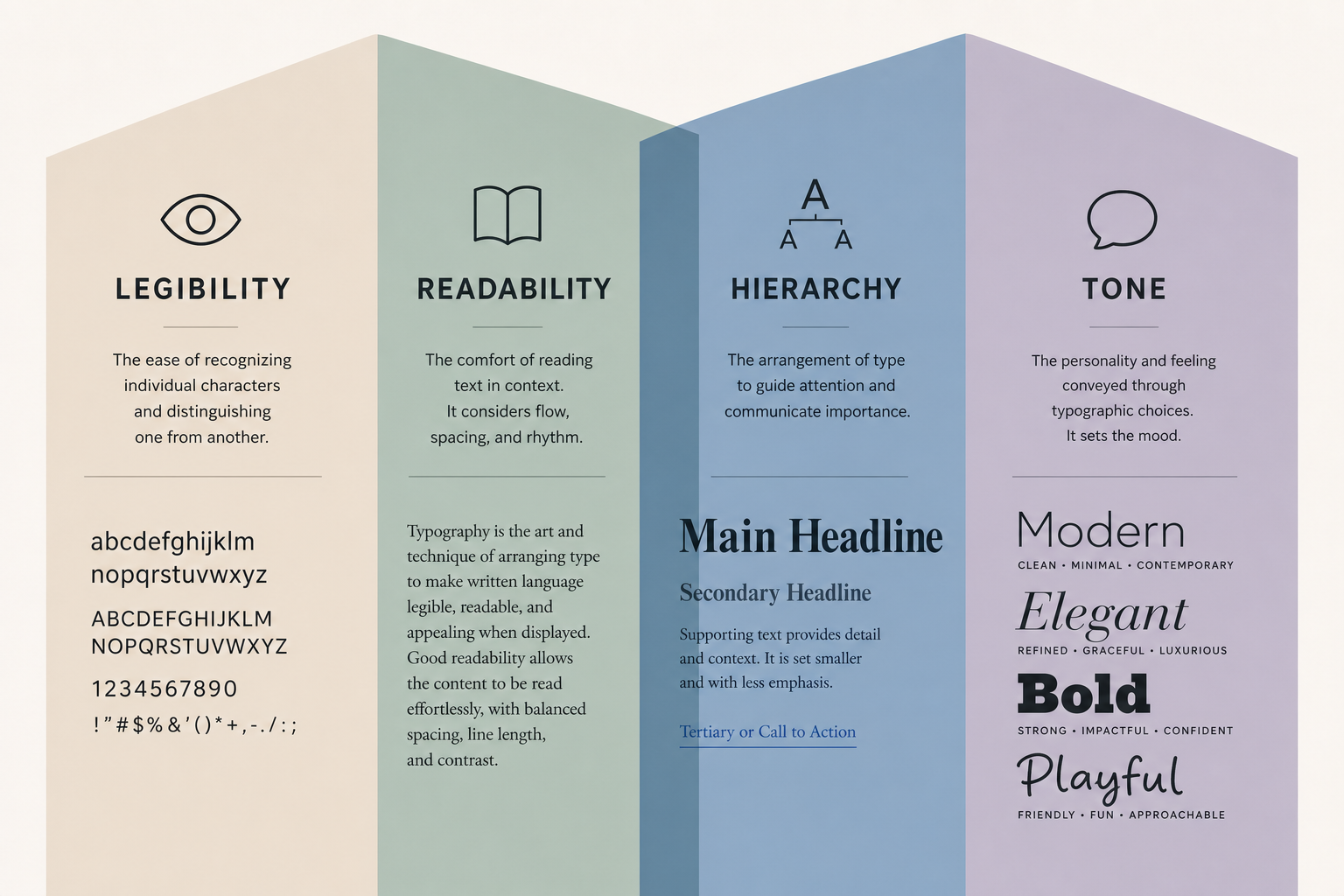
Great typography in design creates invisible scaffolding. When it works, readers absorb content effortlessly. When it fails — wrong size, poor contrast, slow-loading font files — users bounce before they even read a headline. Research published on ResearchGate confirms that typographic properties such as font size and line length are directly correlated with legibility and overall user satisfaction, making type choices as consequential as navigation structure.
- Legibility: The ability to distinguish individual characters at a glance.
- Readability: The ease of processing longer passages of text.
- Hierarchy: Using scale, weight, and spacing to guide the eye through content.
- Tone: Communicating brand personality before a single word is consciously read.
Each of these is a functional UX property, not mere decoration. That shift in perspective is central to modern type design UX practice.
The Evolution of Variable Fonts in Digital Interfaces
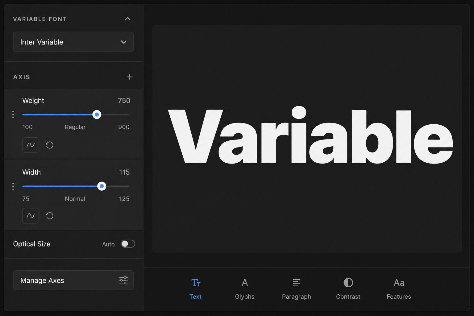
Variable fonts represent the single biggest leap in web typography since web fonts became practical in the early 2010s. Introduced in the OpenType 1.8 specification in 2016, a variable font is a single file that encodes an entire design space — multiple weights, widths, optical sizes, and even custom axes — rather than shipping a separate file for every style. By 2025, support across Chrome, Firefox, Safari, and Edge is effectively universal, making adoption a no-brainer for new projects.
Performance Gains Are Real and Measurable
A traditional type system might load four to eight separate font files for a single typeface family — regular, italic, bold, bold-italic, and so on. Each file is an additional HTTP request and several dozen kilobytes of payload. A single variable font file replaces all of them. In practical tests, switching to a variable font can reduce total font payload by 40–80%, directly improving Core Web Vitals scores, particularly Largest Contentful Paint (LCP).
Design Flexibility Without File Bloat
Beyond performance, variable fonts allow designers to fine-tune weight and width continuously rather than jumping between preset stops. A heading might sit at weight 620 instead of being forced into either 600 (semi-bold) or 700 (bold). Optical size axes let letterforms become slightly more robust at small sizes and more refined at display sizes — all within the same file. Tools like Adobe Fonts (accessible through Adobe Creative Cloud) and Google Fonts now offer extensive variable font libraries, lowering the barrier for any design team to adopt them immediately.
Type Design UX: Matching Typefaces to Interface Context
Selecting the right typeface for a digital product goes beyond taste. The interface context — reading distance, screen resolution, content density, and user task — should drive every decision in type design UX.
Sans-Serif vs. Serif in Screen Environments
The old rule that serif typefaces were strictly for print has dissolved. High-DPI displays render serif letterforms with enough fidelity that they now perform competitively in body text on screens. The real deciding factor is brand alignment and content type: editorial and long-form reading contexts benefit from serifs that create a strong reading rhythm, while dense data interfaces, dashboards, and utility apps typically favour humanist sans-serifs for their clean legibility at small sizes.
Font Sizing and Line Length
Body text should sit between 16px and 20px for most screen contexts. Line length (measure) is optimally 45–75 characters for comfortable reading. These are not stylistic preferences — they map directly to how quickly readers process text and how fatigued they feel after sustained reading. A line that stretches to 100 characters forces the eye to travel too far; one that sits at 30 characters forces too many line breaks, disrupting flow.
Pairing Typefaces Without Creating Chaos
Two typefaces are almost always enough for a digital product. A common pattern pairs a geometric or humanist sans-serif for UI labels, navigation, and captions with a contrasting serif or slab-serif for editorial headings. The contrast creates hierarchy without multiplying file size or cognitive noise. If a third typeface enters the system, it typically should be a monospace for code blocks — never a decorative face for body copy.
Digital Design Typography and Accessibility
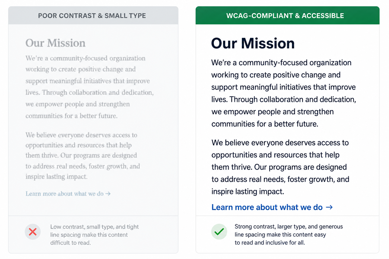
Accessibility is not a bolt-on requirement — it is a quality metric. The Web Content Accessibility Guidelines (WCAG) 2.1 from the W3C set minimum contrast ratios of 4.5:1 for normal-sized text and 3:1 for large text (18px+ or 14px+ bold). These ratios exist because low contrast is one of the leading causes of reading difficulty for users with low vision, colour blindness, or screen glare.
What Accessible Digital Design Typography Looks Like in Practice
- Minimum body text size of 16px, ideally 18px for content-heavy pages.
- Line height of at least 1.5× the font size (e.g. 24px line height for 16px text).
- Paragraph spacing of at least 2× the font size.
- Text that can be resized up to 200% without horizontal scrolling or loss of content.
- Avoiding all-caps for body text (it reduces letter shape recognition and reading speed).
- Prioritising typefaces with clear differentiation between similar characters (1, l, I; 0, O).
Variable fonts add an accessibility dimension here too: their optical size axis can be used programmatically to improve letterform clarity at smaller rendered sizes — making them genuinely useful for responsive accessibility, not just performance.
Expressive Typography: Balancing Creativity and Usability
Not every typographic decision is a utility calculation. Digital design typography in 2025 is also a vehicle for brand expression, and the best interfaces find ways to be visually distinctive without sacrificing function. Display headings set in expressive, high-contrast typefaces draw attention and communicate personality. The key is context isolation: expressive type belongs in headlines, hero sections, and marketing moments — not in form labels, body copy, or error messages where clarity must dominate.
Motion and Kinetic Type
Variable fonts unlock an underused expressive dimension: animation. Because weight, width, and other axes are mathematically interpolatable, a heading can smoothly animate from a light weight on load to a bolder weight on hover — all without JavaScript trickery, and using a single font file. This technique is increasingly common in portfolio and brand sites, and it represents one of the more exciting frontiers where typography in design intersects with motion craft.
Colour and Gradient Type
OpenType COLR/CPAL fonts bring chromatic type rendering into browsers natively, allowing individual letterforms to carry gradient fills or multiple colour layers without resorting to SVG or image workarounds. While still emerging, colour font support in Chrome and Firefox is mature enough for progressive enhancement — a useful brand differentiator for teams willing to explore the format.
Tools for Practising Digital Design Typography
Typography decisions are only as good as the tools that implement them. Several professional environments stand out for serious type work in 2025.
- Adobe Creative Cloud: Adobe Fonts (included with Creative Cloud) provides access to thousands of high-quality typefaces, including a growing variable fonts library, all properly licensed for web use. Designers can activate fonts directly to desktop apps and web projects. A 1-month Adobe Creative Cloud subscription from TopKeyShop starts at €39.50 — a cost-effective entry point for designers who want full access to Adobe Fonts alongside Photoshop, Illustrator, and XD.
- CorelDRAW: Long respected for vector-based design, CorelDRAW includes sophisticated typography controls — kerning, glyph editing, and OpenType feature support — that make it a strong environment for editorial and branding work. The CorelDRAW suite is available at TopKeyShop with lifetime licences from €29.90.
- Figma and browser DevTools: For web-focused type work, Figma’s variable font support allows axis manipulation in the design stage, while browser DevTools let you inspect computed font properties and test rendering live.
- Google Fonts / Adobe Fonts: Free and licensed web font libraries with robust variable font catalogues — the quickest way to test typeface choices in real projects.
Common Digital Design Typography Mistakes to Avoid
Even experienced designers fall into familiar traps. Here are the most common errors in type design UX and how to correct them.
- Loading too many font weights: Every unrequired font variant adds HTTP overhead. Audit which weights you actually render and strip the rest — variable fonts make this particularly easy with
font-variation-settings. - Ignoring font-display: Without the CSS
font-display: swapproperty, users see invisible text while fonts load (FOIT). Settingfont-display: swaporoptionalkeeps text visible during the loading window. - Insufficient contrast on branded colour palettes: Brand colours chosen for marketing materials often fail WCAG contrast requirements when applied as text colours against backgrounds. Always verify contrast ratios with a dedicated checker before launch.
- Using justified text in web interfaces: Unlike print, browsers lack sophisticated hyphenation, so justified text creates irregular word gaps that actively harm readability. Use left-aligned (ragged right) for all body copy.
- Neglecting system font fallbacks: Web fonts can fail to load. A carefully ordered
font-familystack ensures users see a reasonable fallback rather than Times New Roman or Courier appearing unexpectedly.
FAQ
What are variable fonts and why do they matter for digital design?
Variable fonts are a single OpenType font file that contains an entire design space of weights, widths, and other axes, replacing multiple static files. They matter for digital design typography because they significantly reduce page load times — sometimes cutting font payload by more than 40% — while giving designers more granular control over type appearance across responsive layouts.
How does typeface choice affect user experience?
Typeface choice affects legibility, reading speed, emotional tone, and accessibility. A poorly chosen or poorly implemented typeface can slow comprehension, exclude users with visual impairments, and undermine brand perception. Conversely, a well-considered type system creates clarity, hierarchy, and trust. Type design UX treats every typographic parameter — size, weight, line height, measure — as a functional UX lever.
What WCAG guidelines apply specifically to typography?
WCAG 2.1 specifies a minimum contrast ratio of 4.5:1 for normal text and 3:1 for large text. It also requires text to be resizable up to 200% without loss of content, and recommends minimum line height of 1.5× font size and paragraph spacing of 2× font size. These guidelines apply to all text in digital interfaces, including navigation labels and form inputs — not just body copy.
Should I use serif or sans-serif fonts on a website?
Both perform well on modern high-resolution screens. Sans-serif typefaces remain popular for UI elements and utility interfaces due to their clean geometry, while serifs are increasingly used for editorial, long-form, and premium brand contexts where reading rhythm matters. The best approach is testing your specific typeface on the screens and contexts your users actually experience, rather than following an absolute rule.
How can I improve font loading performance?
Use variable fonts where possible to reduce file count, subset fonts to only the character sets you need, apply font-display: swap in your CSS, self-host fonts to reduce third-party DNS lookups, and preload critical font files in your HTML <head>. These steps combined can meaningfully improve Core Web Vitals scores and reduce perceived page load time.
