
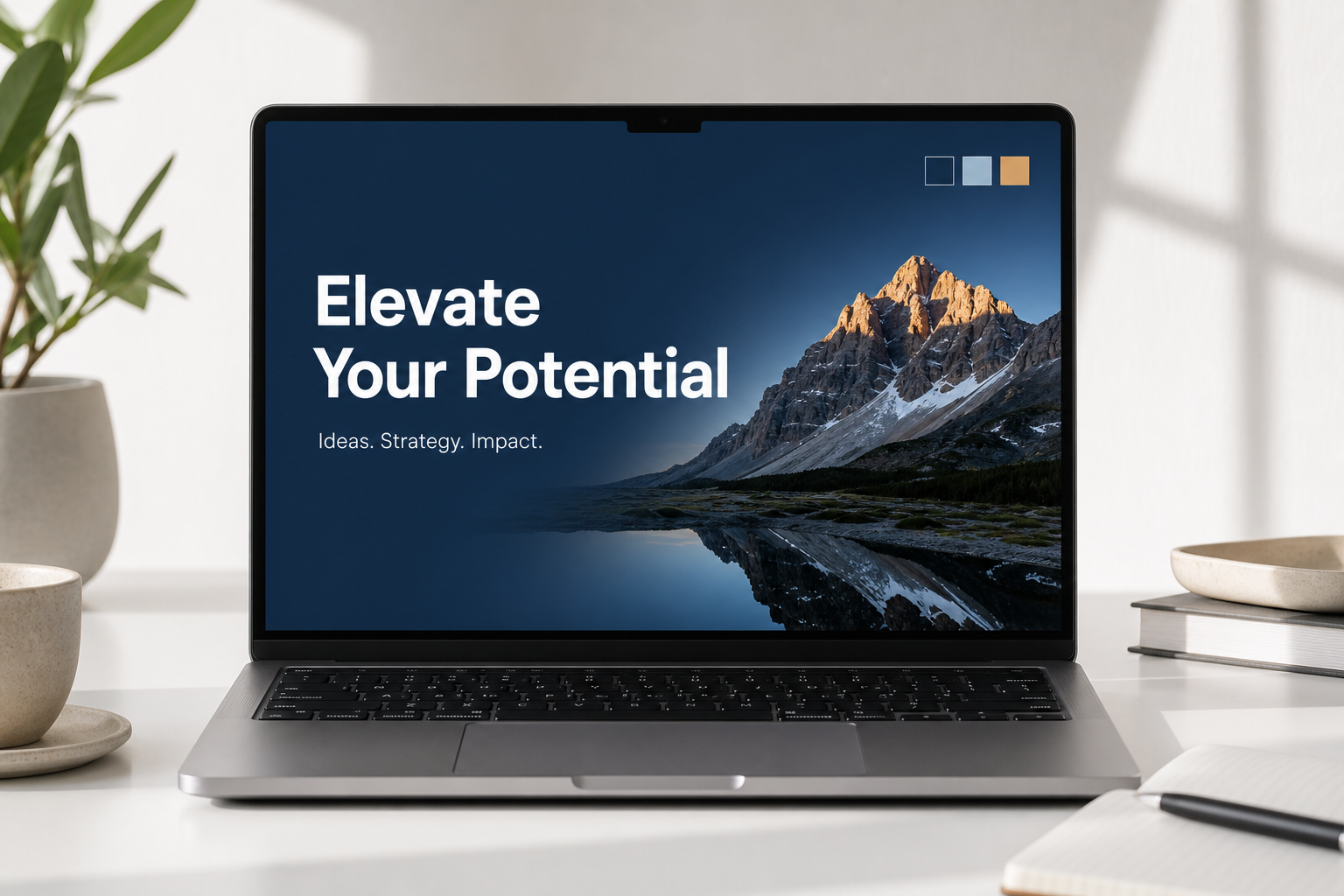
PowerPoint presentation design in 2026 has moved firmly away from the clip-art era of stock templates — and audiences notice the difference instantly. Whether you are pitching to investors, teaching a class, or running an all-hands meeting, the visual quality of your slides signals how seriously you take your audience. This guide walks you through the practical principles that separate forgettable decks from genuinely compelling ones, covering layout, typography, colour, animation, and knowing when to do less.
Why Dated Templates Weaken Your PowerPoint Presentation
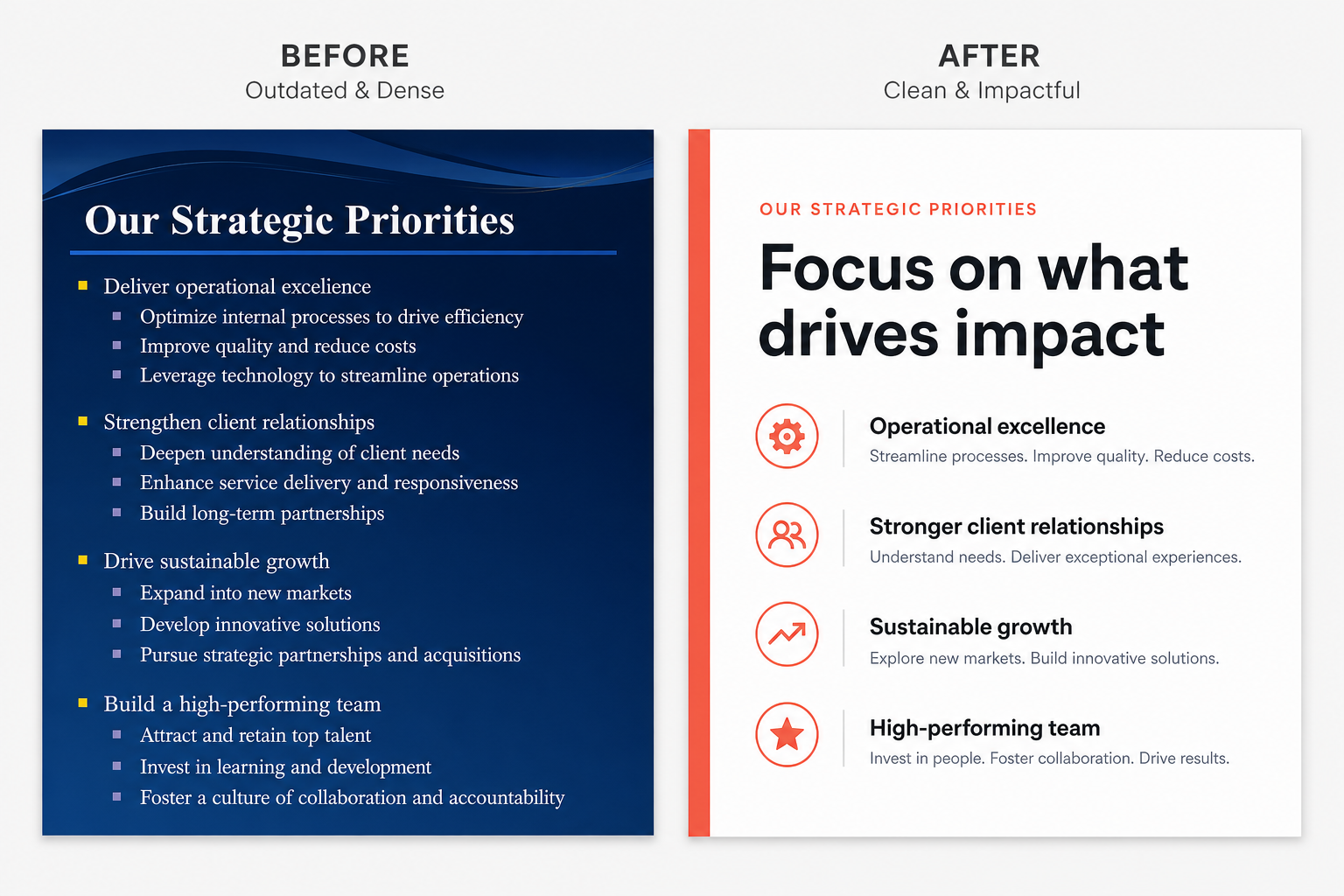
Slide templates shipped with PowerPoint were designed for convenience, not impact. When every second presenter at a conference uses the same navy-blue gradient header and bullet-point waterfall, your deck blends into the noise. More importantly, over-templated slides train audiences to tune out — they have already read a hundred decks that look identical.
Modern PowerPoint design starts with a deliberate blank canvas. You choose a background tone, a type system, and a colour palette that reflect your specific content and audience — not a generic Microsoft stock theme from five years ago. This takes slightly more upfront effort, but the payoff is a presentation that feels like it was made for this moment, not pulled from a dropdown menu.
Layout Principles for Modern Slide Design
Good slide layout is the foundation of effective PowerPoint design tips — everything else builds on it. The goal is to control where the eye travels, and to create breathing room so each point lands clearly.
- One idea per slide. Resist the urge to pack three sub-points onto a single slide. Split them. Your audience cannot read and listen at the same time.
- Use a consistent grid. Align every element to an invisible grid — typically a 12-column structure. PowerPoint’s built-in guides (View → Guides) make this straightforward. Misaligned elements create subconscious unease even when viewers cannot name the cause.
- White space is content. Empty space directs attention. A headline sitting alone in a field of white reads as confident and decisive. The same headline buried in a dense block of bullet points reads as noise.
- Establish visual hierarchy. Primary message largest, supporting detail smaller, source caption smallest. Three levels of type size are usually enough — anything more creates chaos.
- Full-bleed imagery. Where photography is relevant, stretch it edge to edge and overlay semi-transparent panels for text legibility. This approach instantly modernises any deck.
Typography: The Most Underrated PowerPoint Design Tip
Typography choices carry enormous weight in modern PowerPoint slides, yet most presenters never go beyond the default Calibri. In 2026, the leading presentation designers follow a handful of clear rules.
Font Pairing for Your PowerPoint Slides
Choose a maximum of two typefaces: one for headings and one for body text. A geometric sans-serif (Inter, DM Sans, Figtree) paired with a slightly humanist body font (Source Sans 3, Nunito) creates warmth and clarity simultaneously. Avoid decorative scripts entirely — they destroy readability at distance.
Size and Leading
According to Slidesgo’s 2026 Presentation Trends report, body text should sit between 24–32 pt and titles between 44–64 pt to meet WCAG AA contrast standards and ensure readability at the back of a room. If your text goes smaller than 20 pt anywhere on a slide, it almost certainly belongs in a speaker notes panel, not on screen.
Weight and Contrast
Use font weight (bold vs regular) to create emphasis rather than resorting to underlining or all-caps. All-caps works for short labels — three words maximum — but extended all-caps text slows reading speed by roughly 13% compared to sentence case.
Colour Strategy for Compelling PowerPoint Slides
Colour is where PowerPoint slide design either earns trust or loses it fast. The most common mistake is using too many colours pulled from the default theme palette.
Build a Micro Palette
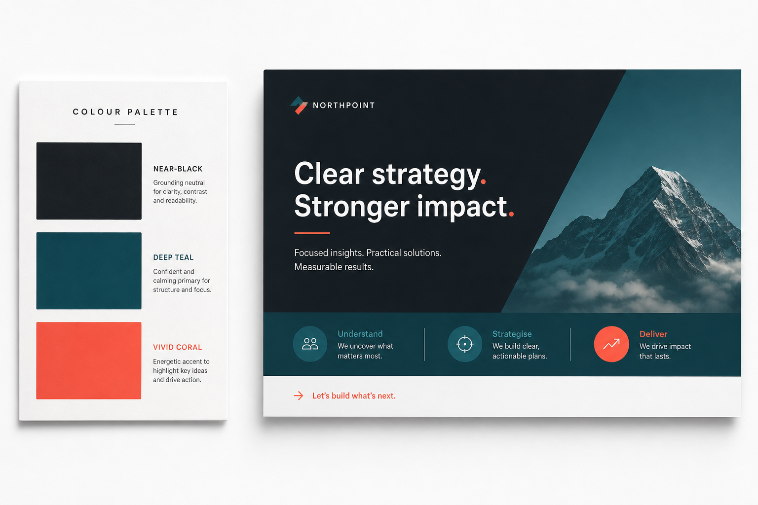
Start with three colours: one dominant neutral (off-white, light grey, or near-black), one primary brand colour, and one accent reserved exclusively for key data points or calls to action. Adding a fourth is fine for infographics; adding a fifth risks visual disorder.
Dark vs Light Backgrounds
Dark backgrounds (deep navy, charcoal, near-black) command attention in large auditoriums and on screens with strong ambient light. Light backgrounds suit boardrooms, printed handouts, and video calls where screen brightness varies. Whichever you choose, maintain a contrast ratio of at least 4.5:1 between text and background — the WCAG AA standard. Tools like Adobe Colour’s accessibility checker make this instant.
Use Colour to Guide the Eye
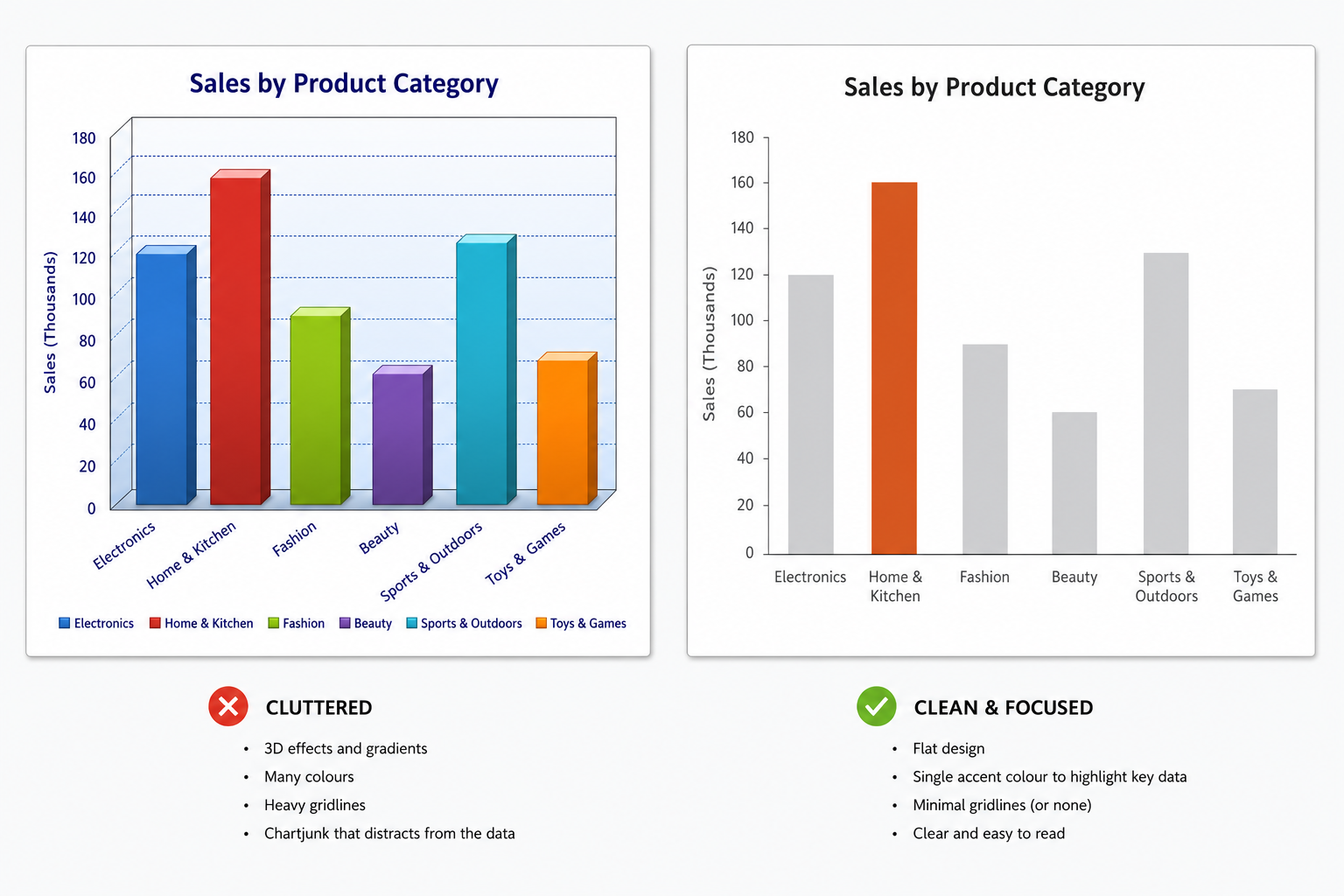
In data visualisations, highlight only the bar, line, or segment you want the audience to notice in your accent colour — grey out everything else. This technique, sometimes called data ink reduction, means your audience reads the insight before you speak it aloud. That is slide design working at its best.
Animations and Transitions: When Less Is More
Animations are the area where even experienced presenters make their worst modern PowerPoint slide mistakes. The rule in 2026 is simple: every animation must serve the narrative, not decorate the slide.
Transitions to Avoid
Cube, Flip, Vortex, and Honeycomb transitions were impressive in 2010. Today they read as dated and amateurish. Stick to Fade or Morph — PowerPoint’s Morph transition, available since Office 2019, remains one of the most powerful tools in the toolkit because it creates smooth, cinematic object-level movement without any coding.
Build Animations
Use Appear or Fade on text builds — never Fly In from bottom-left. Reveal bullet points one at a time only when sequencing genuinely helps comprehension; do not animate bullet points just because the feature exists. A good benchmark: if you can remove an animation without losing meaning, remove it.
The Morph Exception
Morph transitions between duplicate slides create the illusion of a single continuous canvas — a zooming effect that professional designers use to move between an overview slide and a detailed close-up. It is available in Office 2019, Office 2021, and Microsoft 365. If you are on an older version, this is one of the most compelling reasons to upgrade your Office licence.
Data and Infographics: Communicating Numbers Clearly
Slides that need to communicate data are where PowerPoint presentation design separates truly skilled communicators from everyone else. The principle is ruthless simplification.
- Choose the right chart type. Bar charts for comparison, line charts for change over time, scatter plots for correlation. Pie charts should show a maximum of five segments — any more and the proportions become unreadable.
- Remove chart junk. Delete gridlines, border boxes, and 3D effects. They add visual weight without adding information.
- Lead with the insight. Title your chart with the conclusion, not the variable. Instead of “Monthly Revenue by Region Q1–Q4 2025”, write “Western Region Outperformed Targets in Every Quarter”.
- Use icons, not clip art. Flat-style line icons from sources like Flaticon or the icon sets built into Microsoft 365 look clean and modern in 2026 without the illustrative baggage of old clip art libraries.
PowerPoint Design Tips for Consistency Across Every Slide
Consistency is what makes a deck feel designed rather than assembled. Use PowerPoint’s Slide Master (View → Slide Master) to define your fonts, colours, logo placement, and grid globally — changes cascade to every slide automatically, and you never accidentally drift into a different font or margin size on slide 34.
Create a small library of master layouts: a title slide, a section divider, a text-and-image split, a full-bleed visual, and a data slide. Six to eight master layouts cover the vast majority of real presentation needs. If you find yourself deviating from them repeatedly, update the master — do not start formatting individual slides by hand.
Getting the Right Software for Polished Slide Design
None of these PowerPoint design tips are achievable without a properly licensed, up-to-date version of Microsoft Office. The Morph transition, Designer suggestions, and the latest font rendering improvements all require Office 2019 at minimum, with the best experience in Office 2021 or Microsoft 365.
If you are still running Office 2016 or earlier, the tools available to you are genuinely limited — and it shows in what you can produce. TopKeyShop offers Office 2021 Professional Plus for Windows starting from €15.90, giving you the full PowerPoint toolkit including Morph, Designer AI, and the complete set of modern icon libraries. For teams wanting to understand the ongoing cost comparison, the blog post on lifetime Microsoft Office licence price vs Microsoft 365 breaks down which option wins over time.
If your presentations rely heavily on embedded macros or interactive elements, enabling macros securely is also worth understanding — the guide on how to enable macros in Microsoft Office covers every scenario safely.
The Minimalist Principle: When to Do Less
The most advanced PowerPoint presentation design principle is restraint. Every element on a slide should earn its place by either communicating information, guiding attention, or establishing brand context. Everything else is noise.
Try this test on your next deck: cover every element on each slide with your hand, reveal them one by one, and ask whether the slide still works without each one. Remove anything that fails the test. Most experienced designers cut 30–40% of the visual elements in a first draft before they are happy. That is not overthinking — it is the difference between slides that support a speaker and slides that compete with one.
In 2026, with attention spans shorter and meeting fatigue higher than ever, the presentations that land are the ones that say exactly what they need to say, exactly as clearly as possible, and then get out of the way.
FAQ
What is the best font size for PowerPoint slides in 2026?
Body text should be at least 24 pt, ideally 24–32 pt, to remain legible from the back of a typical meeting room. Slide titles should sit between 44–64 pt. Anything below 20 pt is better placed in your speaker notes than on screen, as small text forces the audience to read rather than listen to you.
How many colours should I use in a presentation?
A three-colour palette — one neutral, one primary, one accent — is the standard for modern PowerPoint slides. You can extend to four for complex infographics, but beyond that you risk visual clutter. Use your accent colour sparingly: it only creates emphasis when it appears rarely. Overuse eliminates its power entirely.
Should I use animations and transitions?
Yes, but only where they serve the narrative. The Fade and Morph transitions are the two safest choices in 2026. Avoid showy transitions like Cube or Vortex, which feel dated. For text builds, Appear or Fade works best — fly-in animations distract rather than emphasise. When in doubt, remove the animation and see whether the slide still communicates clearly.
What is the Morph transition and do I need a specific Office version?
Morph creates smooth, cinematic movement between two slides that share common elements — it is ideal for zooming from an overview to a detail view, or animating a chart update. It requires Office 2019, Office 2021, or a Microsoft 365 subscription. If you are on Office 2016 or earlier, upgrading your licence unlocks this feature along with several other modern design tools.
How do I avoid my slides looking like a generic template?
Start from a blank slide rather than a built-in theme. Define your own colour palette, choose two custom fonts, and build your layouts in Slide Master before you write a single word of content. Avoid the default Calibri/Cambria font pair, the standard blue/orange colour scheme, and any shape or icon from the legacy clip-art library. These three changes alone will make your deck look considerably more polished and purposeful.
Does slide design matter for virtual presentations?
More than ever. On a video call, your slides fill the entire screen — there is no room ambience, no projector glow, no physical presence to carry attention. High-contrast colour schemes, larger type, and minimal clutter matter even more in a virtual context than in a live room. Treat every online presentation as if your slides are the primary communication channel, not just a backdrop.
